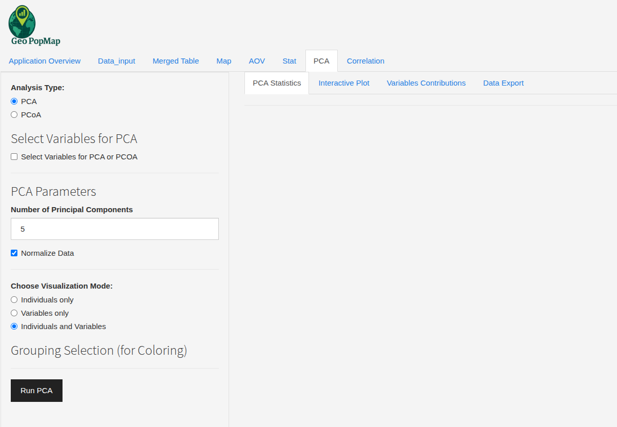
Correlation Analysis
Note
Correlation analysis in GeoPopMap is performed directly on the merged data table. The module offers advanced options for variable selection, visualization, customization, and export. Missing values are handled automatically.
1. Variable Selection
Click “Select Variables for Correlation” to choose which numeric variables to include.
You can select as many variables as you want; only numeric variables are available.
Selecting variables for correlation analysis.
2. Running the Analysis
Click the “Run Correlation” button.
The application computes the correlation matrix using pairwise complete observations (ignoring missing values for each pair).
3. Results and Visualization
Correlation Matrix: View the matrix of correlation coefficients (Pearson by default) between all selected variables.
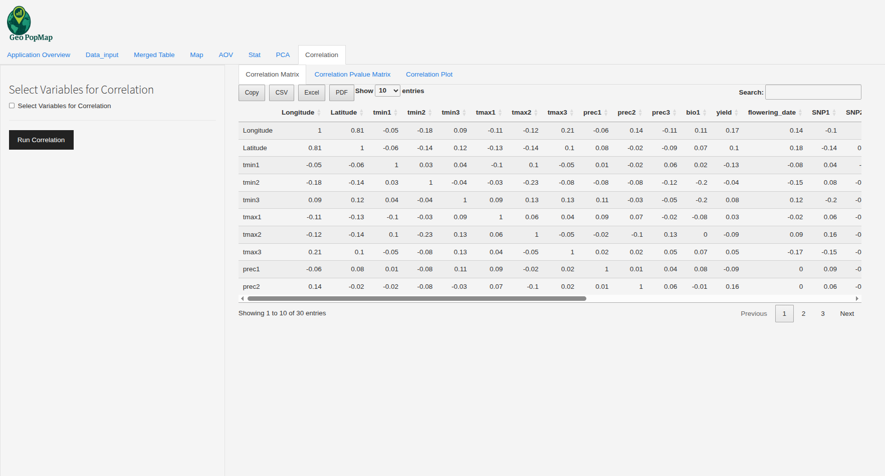
The correlation matrix heatmap.
P-value Matrix: View the matrix of p-values for each correlation coefficient, indicating statistical significance.
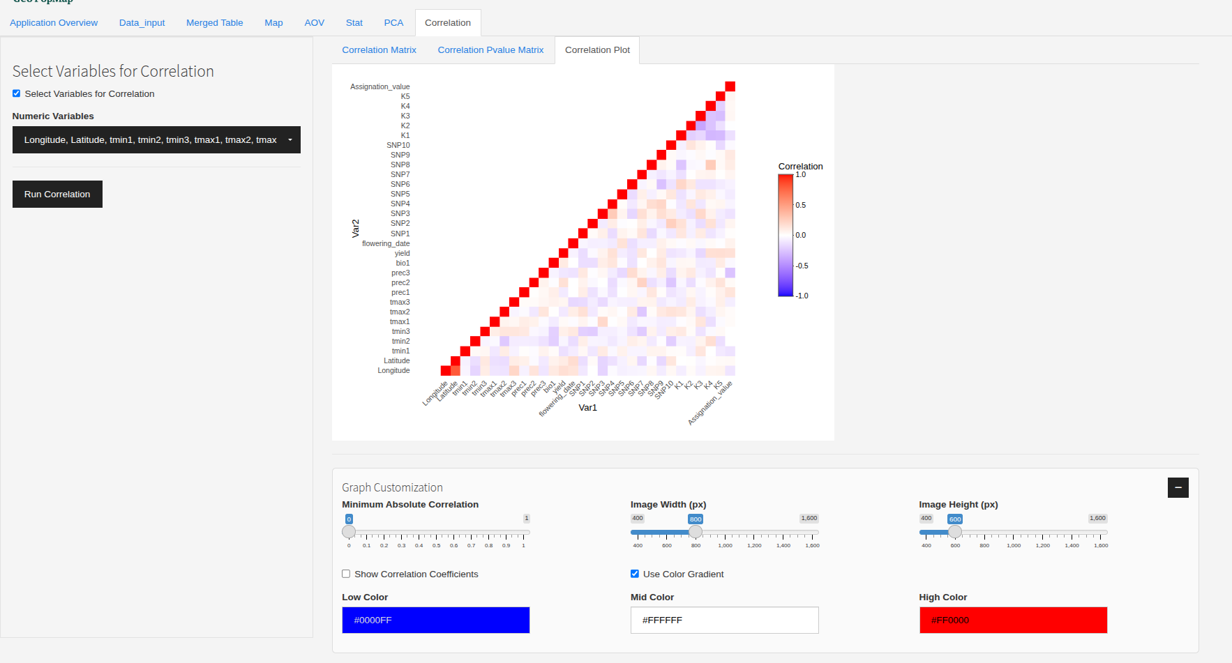
Correlation Plot: - If exactly two variables are selected, a scatterplot with regression line and R² is shown. - If more than two variables are selected, a heatmap of the correlation matrix is displayed. - Hover for tooltips with variable names, correlation, and p-value.
4. Plot Customization
Correlation Threshold: Filter the heatmap to show only correlations above a certain absolute value.
Show Values: Option to display correlation coefficients on the heatmap.
Color Gradient: Choose custom colors for low, mid, and high correlation values.
Image Size: Adjust the width and height of the plot.
Interactive Plot: All plots are interactive (zoom, hover, tooltips).
5. Export
Export Matrix: Download the correlation or p-value matrix as CSV, Excel, or PDF.
Export Plot: Download the plot as PNG, SVG, or HTML with custom size and background.
6. Handling Missing Data
Correlations are computed using pairwise complete observations (use = “pairwise.complete.obs”), so missing values are ignored for each pair of variables.
No imputation is performed; only available data for each pair is used.
7. Example Workflow
Select the variables to include in the analysis.
Click “Run Correlation”.
Explore the correlation matrix, p-value matrix, and plots.
Adjust the threshold and colors for better visualization.
Export results as needed.
8. Best Practices
Select only relevant numeric variables to avoid cluttered plots.
Use the threshold slider to focus on strong correlations.
Always check p-values to assess the significance of correlations.
Export your results for further analysis or publication.
The main interface for correlation analysis.
Next Steps
After exploring the correlations, you can perform a Principal Component Analysis (PCA) or ANOVA Analysis for deeper multivariate analysis.