Map Visualization
This section explains how to use the interactive map visualization features in GeoPopMap to explore, compare, and export your spatial data. All features are illustrated with visual examples.
1. Accessing the Map Interface
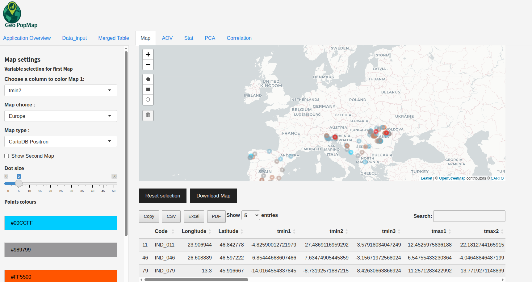
Navigate to the “Map Visualization” tab. You will see a world map with your data points plotted.
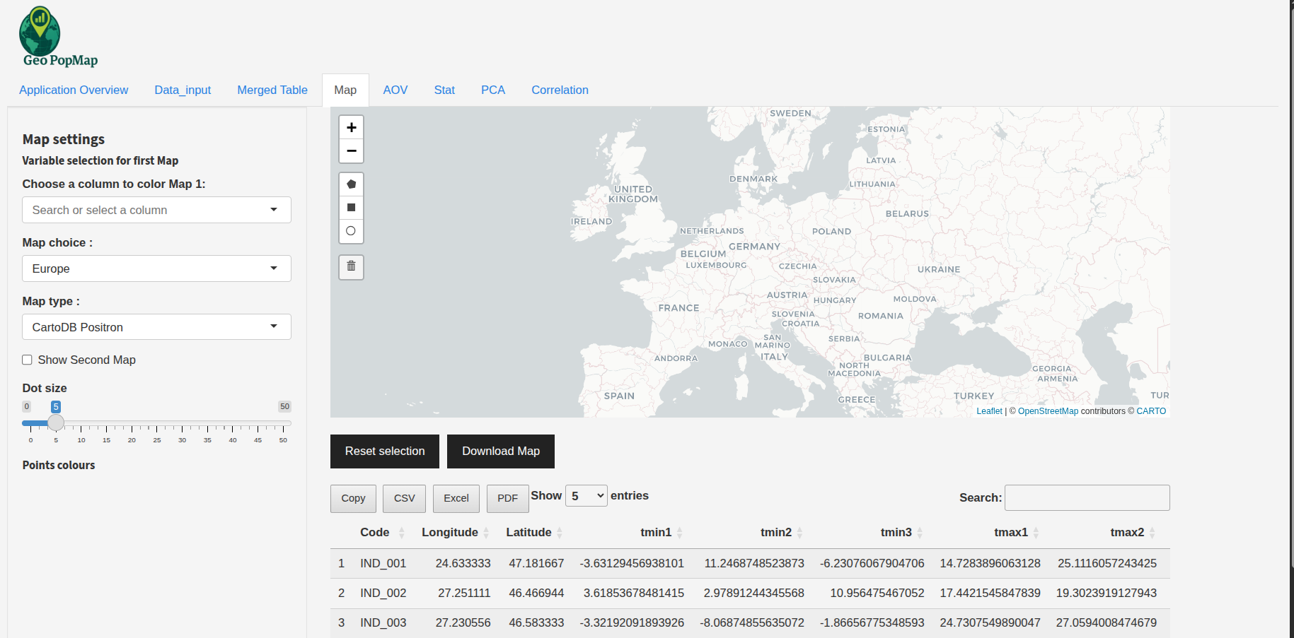
The main map visualization interface.
2. Map Display and Navigation
Zoom and Pan: Use your mouse or trackpad to zoom in/out and move the map.
Region Selection: Choose a predefined region (World, Europe, France, Germany, USA) to quickly focus the map.
Map Background: Select the map tile type (OpenStreetMap, CartoDB Positron, Esri Satellite) for your preferred style.
Example: Changing the map background and region.
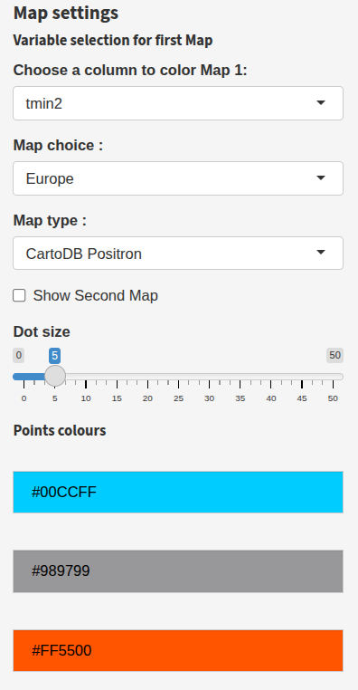
3. Coloring and Variable Selection
Variable Selection: Use the dropdown to select which variable to display on the map (e.g., structure, phenotype, climate).
Coloring: - For numeric variables: a customizable color gradient is used. - For categorical variables: each category can be assigned a custom color.
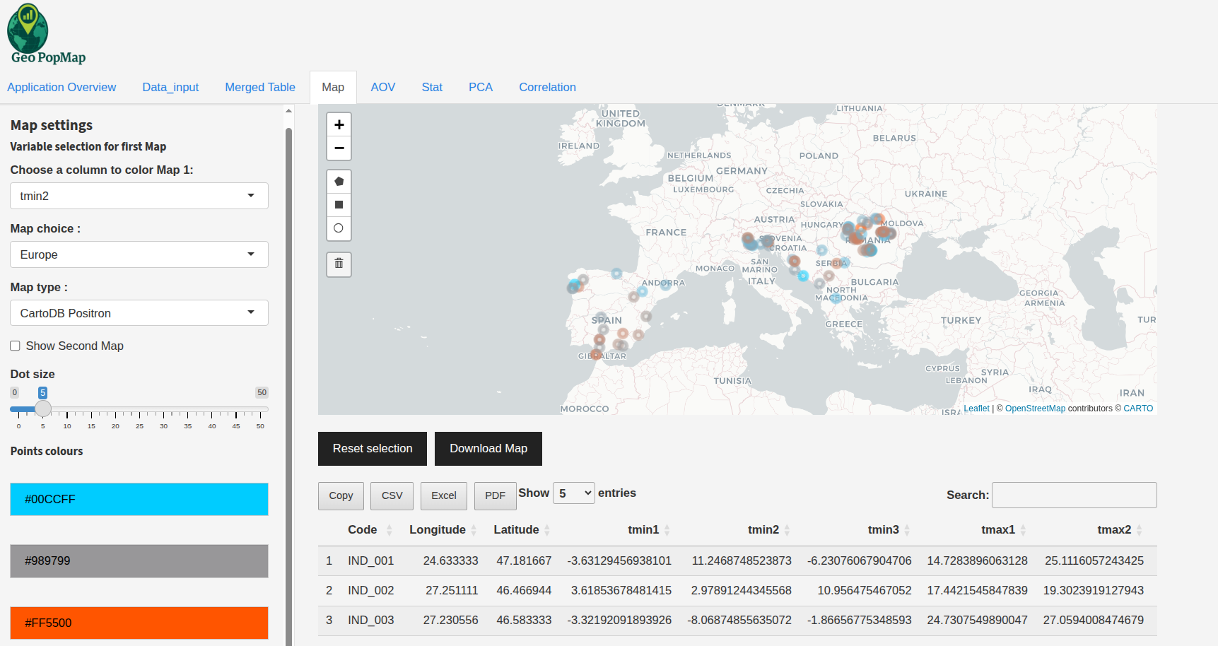
Example: Coloring points by a selected variable.
4. Advanced Customization
Dot Size: Adjust the size of the points using the slider.
Color Pickers: For numeric variables, choose the gradient colors. For categorical variables, pick a color for each category.
Dual Map Comparison: Enable the “Show Second Map” option to compare two variables side by side. Each map can have its own variable, region, and color settings.
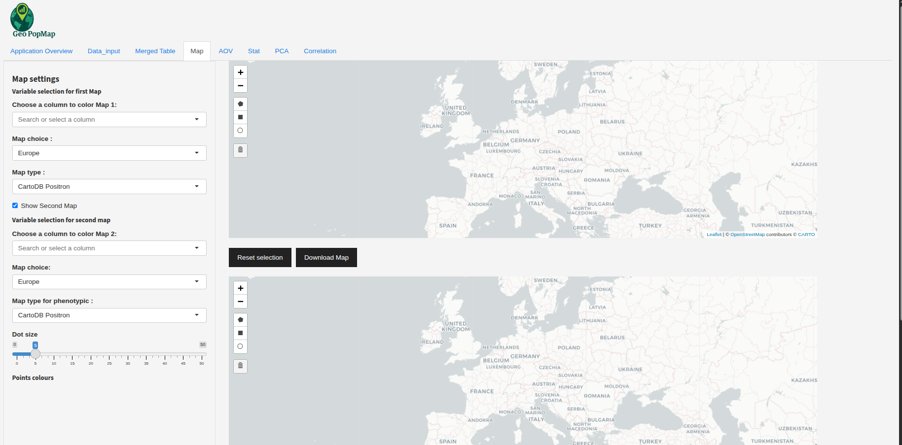
Example: Comparing two variables on two maps (add your own screenshot if available).
5. Interactive Point Selection
Click Selection: Click on a point to view its details in a popup and select it. The corresponding row will also be highlighted in the table below the map.
Example: Selecting a single point on the map and seeing it highlighted in the table below.
Polygon/Rectangle Selection: Use the drawing tools to select multiple points by drawing a shape (polygon or rectangle) on the map. All selected points will be shown in the table below.
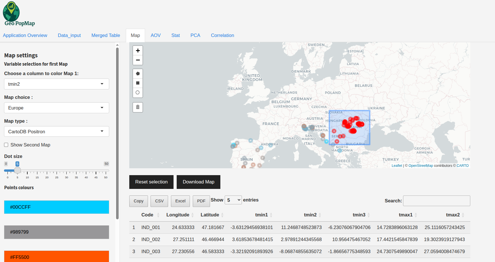
Example: Selecting a zone on the map and seeing all included points in the table below.
Synchronized Selection (Dual Map): When dual maps are enabled, selecting a point or a zone on one map will automatically select and highlight the same points on the other map, and all selected points will be displayed in the table below.
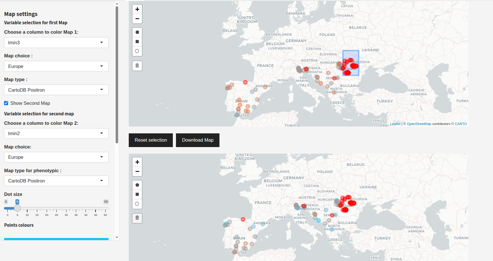
Example: Selecting a point or zone on one map, with the selection synchronized on the second map and shown in the table below.
6. Viewing and Exporting Selected Data
Selected Table: The table below the map shows all currently selected points and their data.
Export Table: Download the selected data as CSV, Excel, or PDF using the export buttons.
7. Reset and Export Map
Reset Selection: Use the “Reset selection” button to clear all selected points.
Delete Layers: After clicking “Reset selection”, click on the trash icon to completely remove the layer from the map.

Example: Clicking the trash icon to delete layers after resetting selection.
Export Map: Click “Download Map” to export the current map as PNG, SVG, or HTML. A modal will let you choose the format.
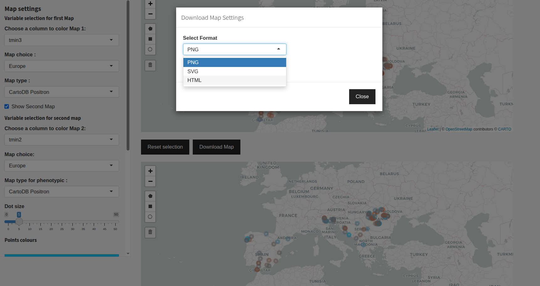
Example: Exporting the map.
8. Use Cases and Best Practices
Visualize genetic structure by region: Color points by structure assignment and focus on a specific country.
Compare phenotype and structure: Use dual maps to compare two variables side by side.
Select and export specific populations: Draw a polygon to select a region and export the data for further analysis.
Tips:
Always check your variable types (numeric vs categorical) for optimal coloring.
Use the region and background options to make your map more readable.
Export your maps and selections for publication or further analysis.
Next Steps
After exploring your data on the map, you can proceed to perform a Principal Component Analysis (PCA) to analyze the relationships between your variables.