Principal Component Analysis (PCA)
Note
PCA in GeoPopMap is performed directly on the merged data table or on genotypic data (PCoA). The module offers advanced options for variable selection, component choice, visualization, grouping/coloring, and missing data handling.
Overview
Principal Component Analysis (PCA) in GeoPopMap allows you to explore the structure of your data, reduce dimensionality, and visualize relationships between variables and individuals. The module also supports Principal Coordinate Analysis (PCoA) for genotypic data.
1. Analysis Type: PCA vs PCoA
PCA: Standard Principal Component Analysis on the merged data table (phenotypic, climatic, etc.).
PCoA: Principal Coordinate Analysis, available for genotypic data (distance-based, e.g., SNPs).
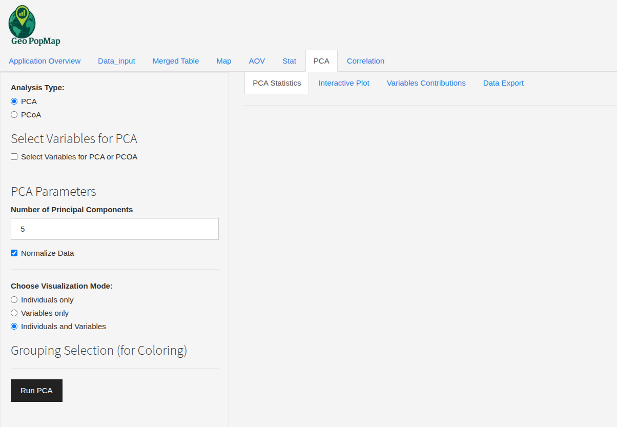
The main interface for PCA and PCoA selection.
2. Variable Selection
Click “Select Variables for PCA or PCOA” to choose which numeric variables to include.
For PCoA, only genotypic variables are available.
You can select as many variables as you want; only those with variance > 0 are used.
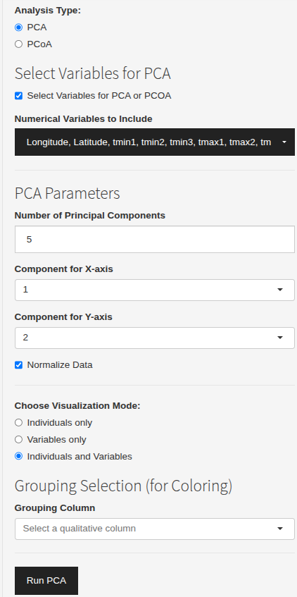
Selecting variables for PCA or PCoA.
3. PCA Parameters
Number of Principal Components: Choose how many components to compute (default: 5).
Component Axes: Select which components to display on the X and Y axes (e.g., PC1 vs PC2).
Normalization: Option to normalize (center/scale) the data before analysis.
4. Visualization Modes
Individuals only: Show only the individuals (samples) in the plot.
Variables only: Show only the variables (arrows).
Individuals and Variables: Show both on the same plot.
5. Grouping and Coloring
Grouping Column: Select a qualitative variable (e.g., population, structure group) to color individuals.
Color Palette: Choose between Default, Viridis, Rainbow, or manually pick colors for each group.
Ellipses: Option to add confidence ellipses around groups (with fill, type, transparency, and line style).
6. Plot Customization
Point Size: Adjust the size of individual points.
Label Size: Adjust the size of variable labels.
Arrow Width/Transparency: Customize the appearance of variable arrows.
Variable Scale and Label Offset: Fine-tune the display of variable vectors.
Display Mode: Show individuals as points or labels.
7. Variance Explained
Scree Plot: Visualize the variance explained by each principal component (bar/line/cumulative).
Number of PCs to Display: Choose how many components to show in the scree plot.
Show values on bars: Option to display variance percentages.
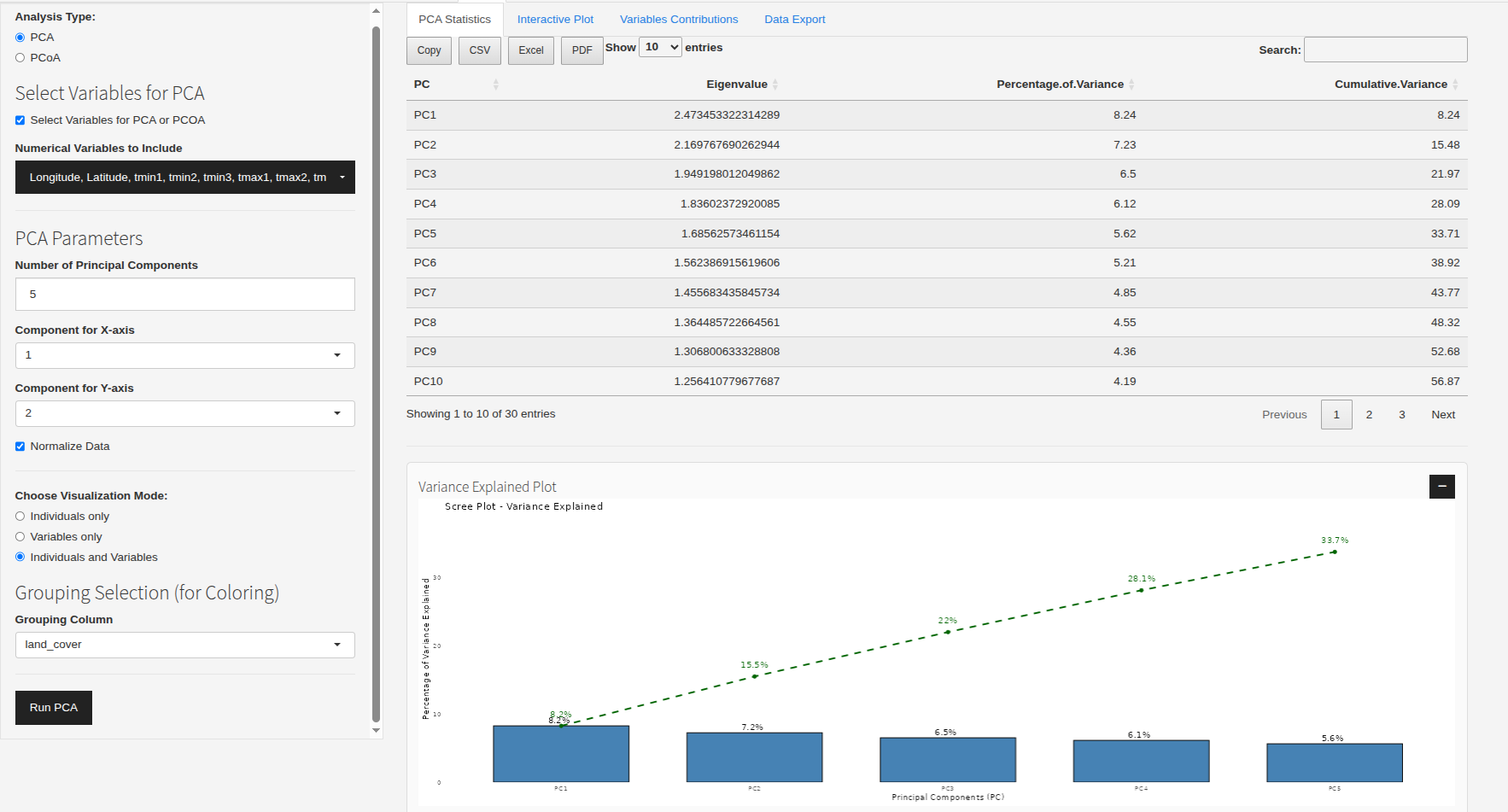
Example: Scree plot and PCA plot.
8. Variable Contributions
View the contribution of each variable to each principal component (table exportable).
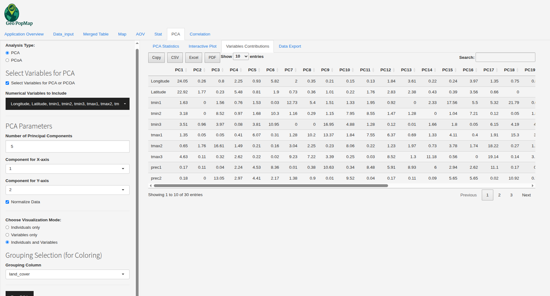
Example: Table of variable contributions to each principal component.
9. Data Export
Export the selected data used for PCA as CSV, Excel, or PDF.
10. Interactive Plot
The PCA plot is interactive (zoom, hover, tooltips).
Download the plot as PNG, SVG, or HTML with custom size and background.
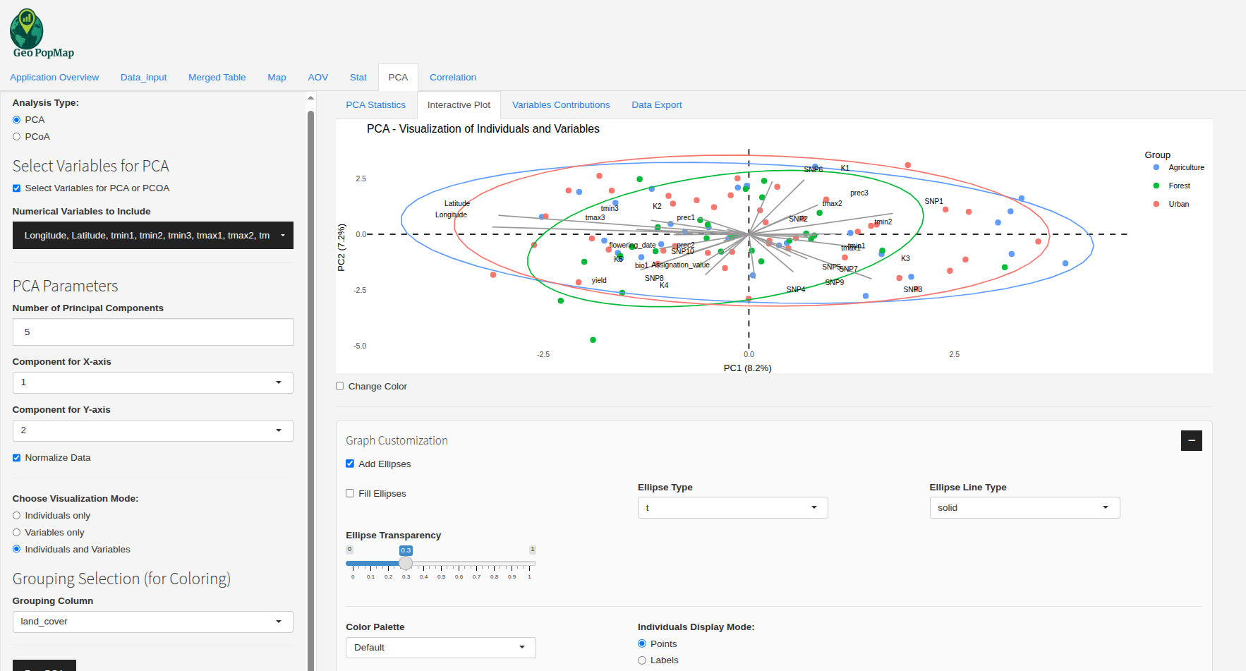
Example: Interactive PCA plot.
11. Handling Missing Data
If missing values (NA) are present, the module uses missMDA::imputePCA to impute them before running PCA.
How does imputePCA work?
It uses a regularized iterative PCA algorithm to estimate missing values.
The method alternates between estimating the principal components and imputing missing values based on the current PCA model, until convergence.
The number of components used for imputation is set by the user (ncp).
This approach preserves the global structure of the data and is robust for moderate amounts of missingness.
11. Example Workflow
Select PCA or PCoA.
(Optional) Select variables to include.
Set the number of components and axes.
Choose visualization mode and grouping/coloring options.
Run the analysis.
Explore the scree plot, PCA plot, variable contributions, and export results.
Best Practices
Always check your variable types and missing data before running PCA.
Use grouping and coloring to reveal structure in your data.
Use the scree plot to decide how many components to interpret.
Export your results for further analysis or publication.
Next Steps
After analyzing the PCA results, you can explore the relationships between variables in more detail with a Correlation Analysis.